Carl Friedrik Artic Grey Launch
Digital, Video
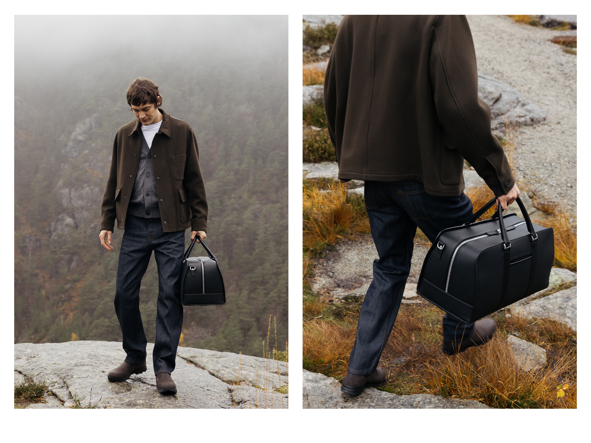
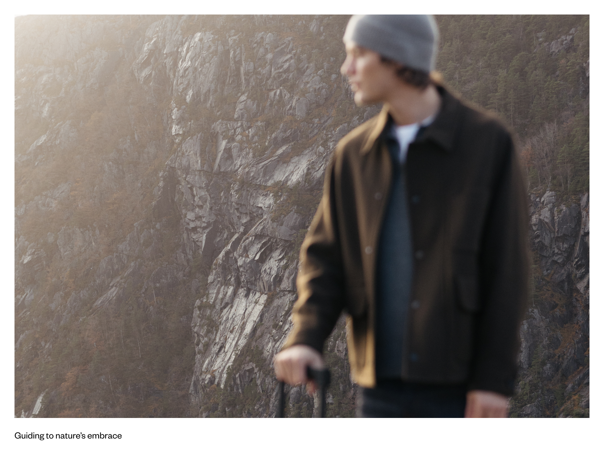
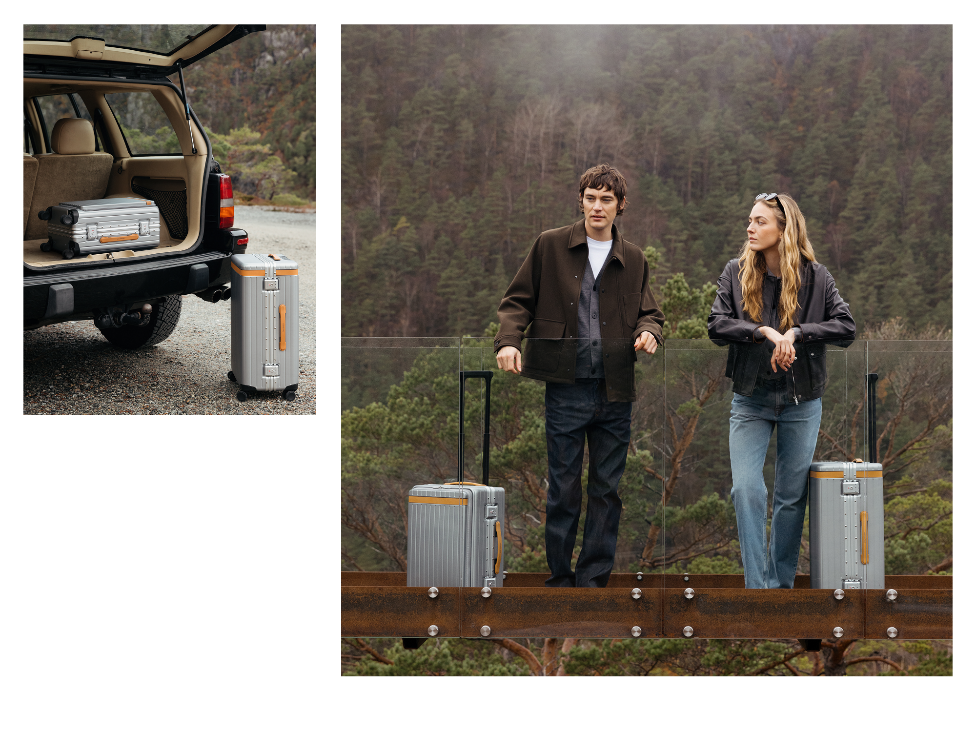
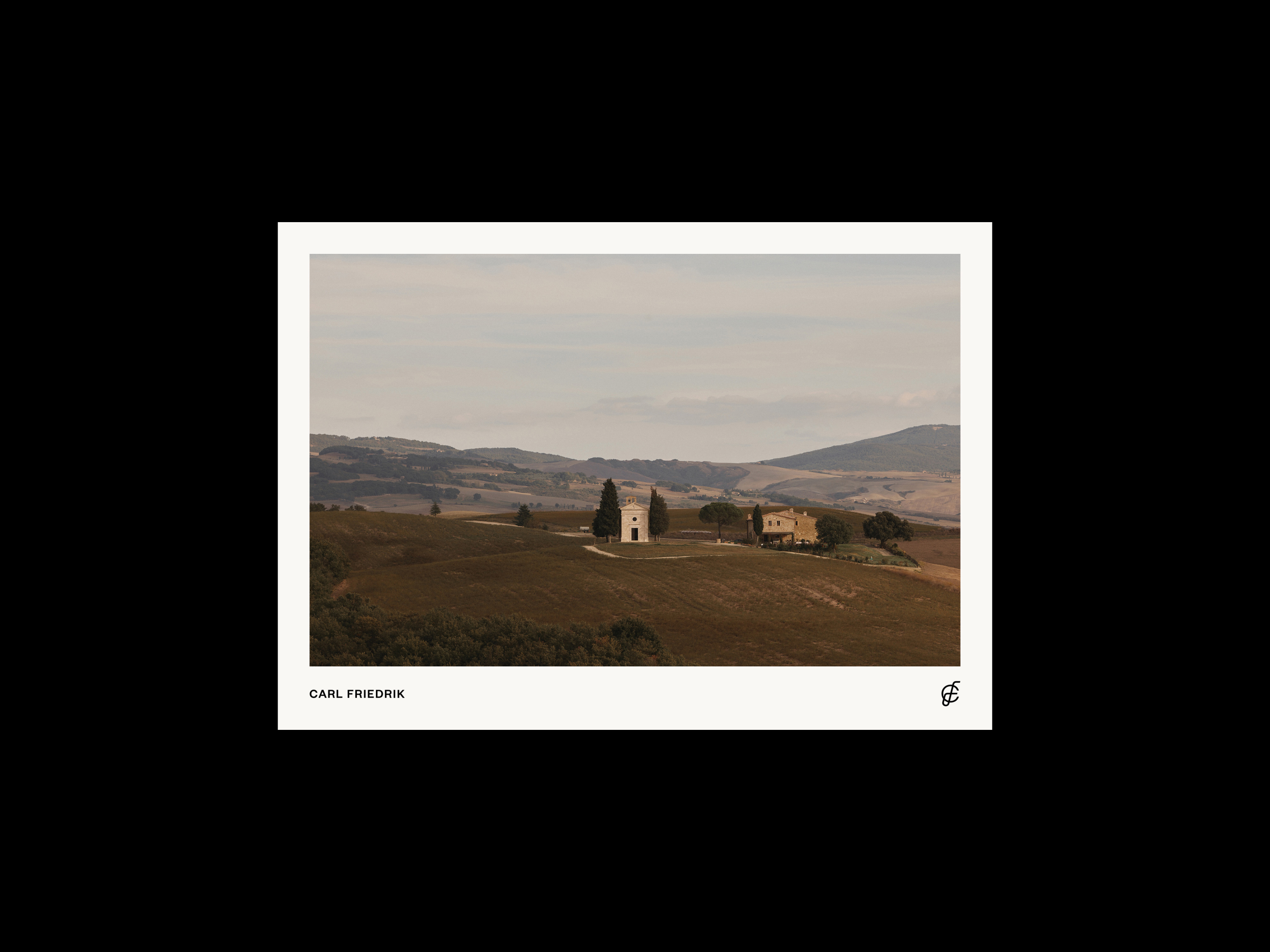
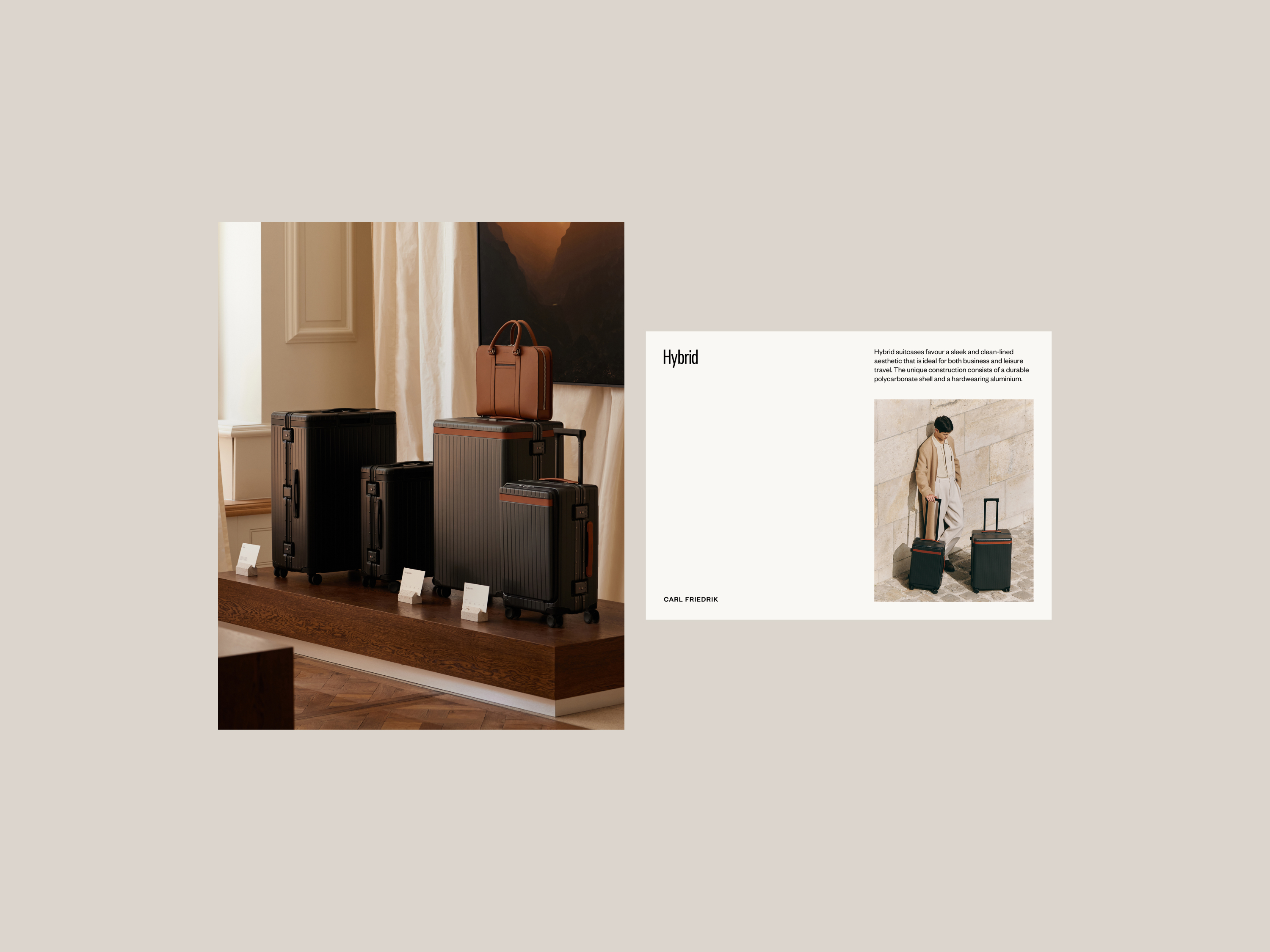
For the Arctic Grey luggage launch, I built a serene digital journey inspired by Norway’s Lysefjord. I designed the journal page, curated imagery from the shoot, and integrated the new products into the website experience. A launch video and refined layouts brought the tranquil, Nordic aesthetic to life, inviting customers to travel further with style and serenity
Digital, Video
Details ︎︎︎
For the Arctic Grey luggage launch, I built a serene digital journey inspired by Norway’s Lysefjord. I designed the journal page, curated imagery from the shoot, and integrated the new products into the website experience. A launch video and refined layouts brought the tranquil, Nordic aesthetic to life, inviting customers to travel further with style and serenity


Carl Friedrik Digital Rebrand
Website Design, Email Design, Social
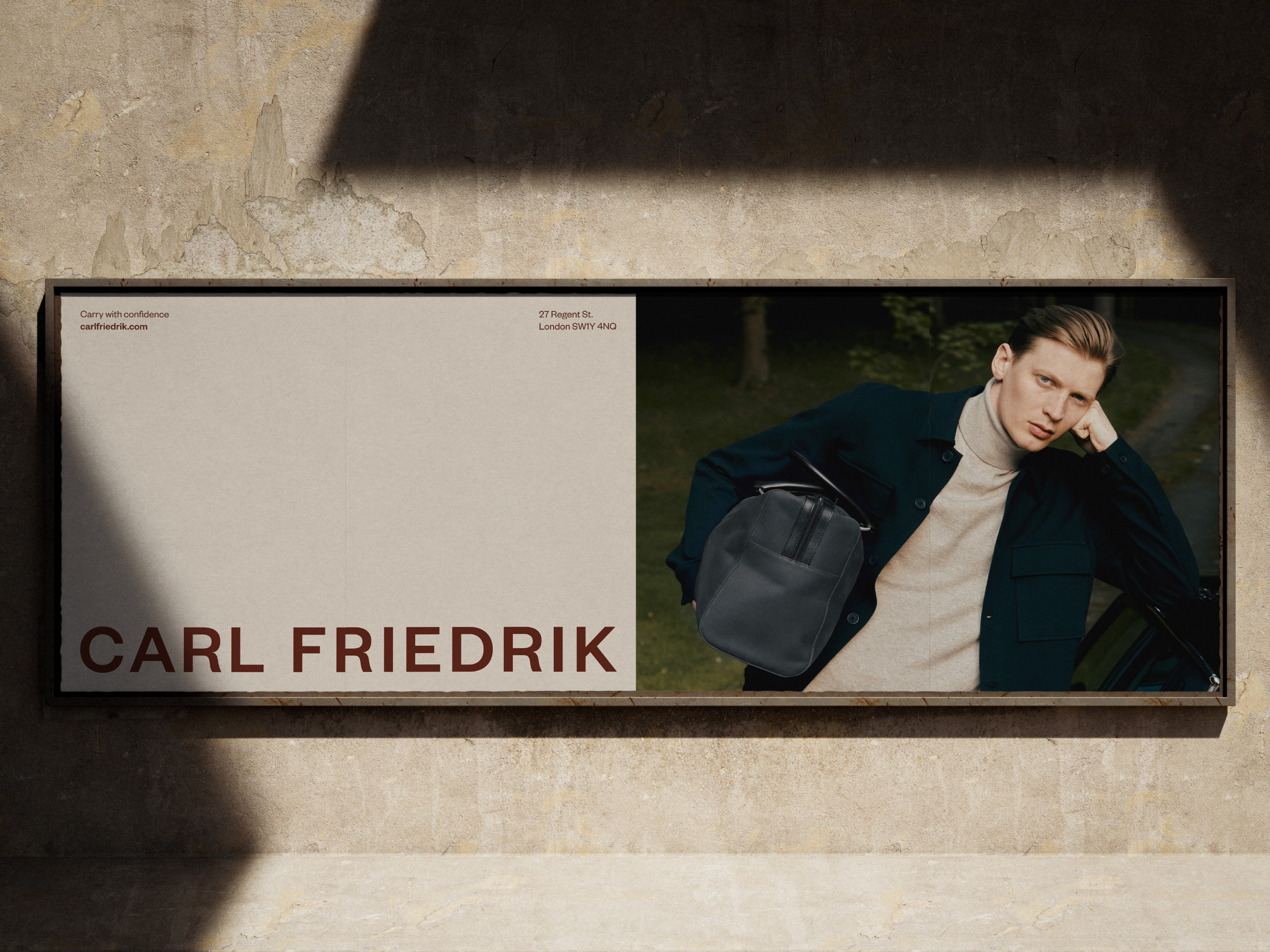
Extending the redefined brand identity, I applied Carl Friedrik’s new visual language across website, email, and social media. For the website, I developed and designed wireframes and layouts, introduced UX enhancements, created journal pages, produced web-optimised imagery and added a product comparison feature, while adapting the refreshed colour palette for digital.
In tandem, I designed a modern, refined email journey aligned with the updated aesthetic and created social assets and stories for launches, ensuring every touchpoint delivered a cohesive and engaging customer experience.
Website Design, Email Design, Social
Details ︎︎︎
Extending the redefined brand identity, I applied Carl Friedrik’s new visual language across website, email, and social media. For the website, I developed and designed wireframes and layouts, introduced UX enhancements, created journal pages, produced web-optimised imagery and added a product comparison feature, while adapting the refreshed colour palette for digital.
In tandem, I designed a modern, refined email journey aligned with the updated aesthetic and created social assets and stories for launches, ensuring every touchpoint delivered a cohesive and engaging customer experience.
Carl Friedrik Visual Rebrand
Brand Identity, Store Design, Packgaging
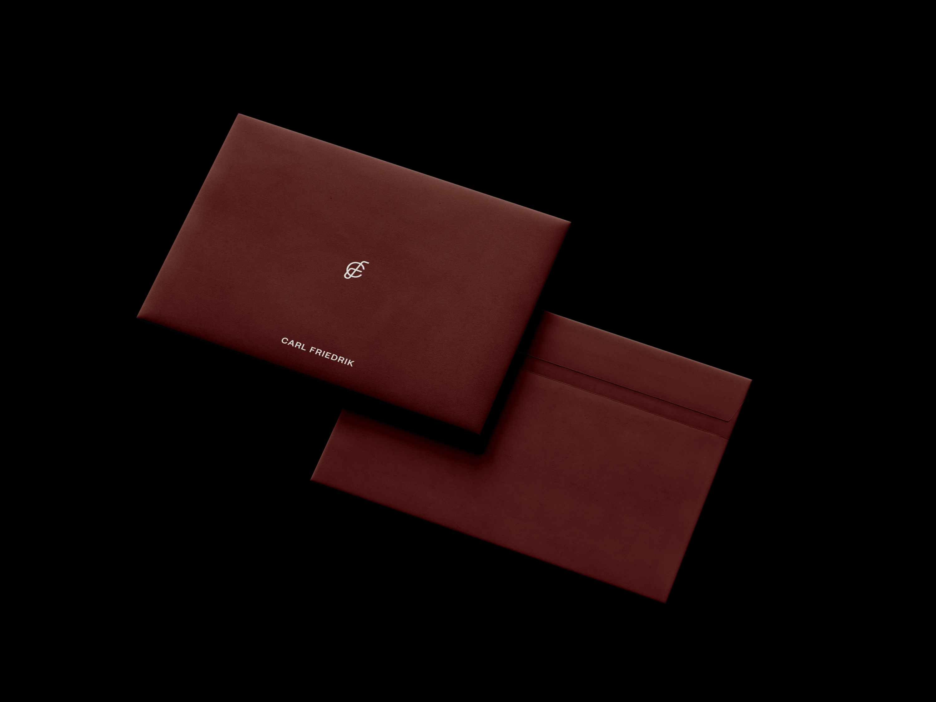
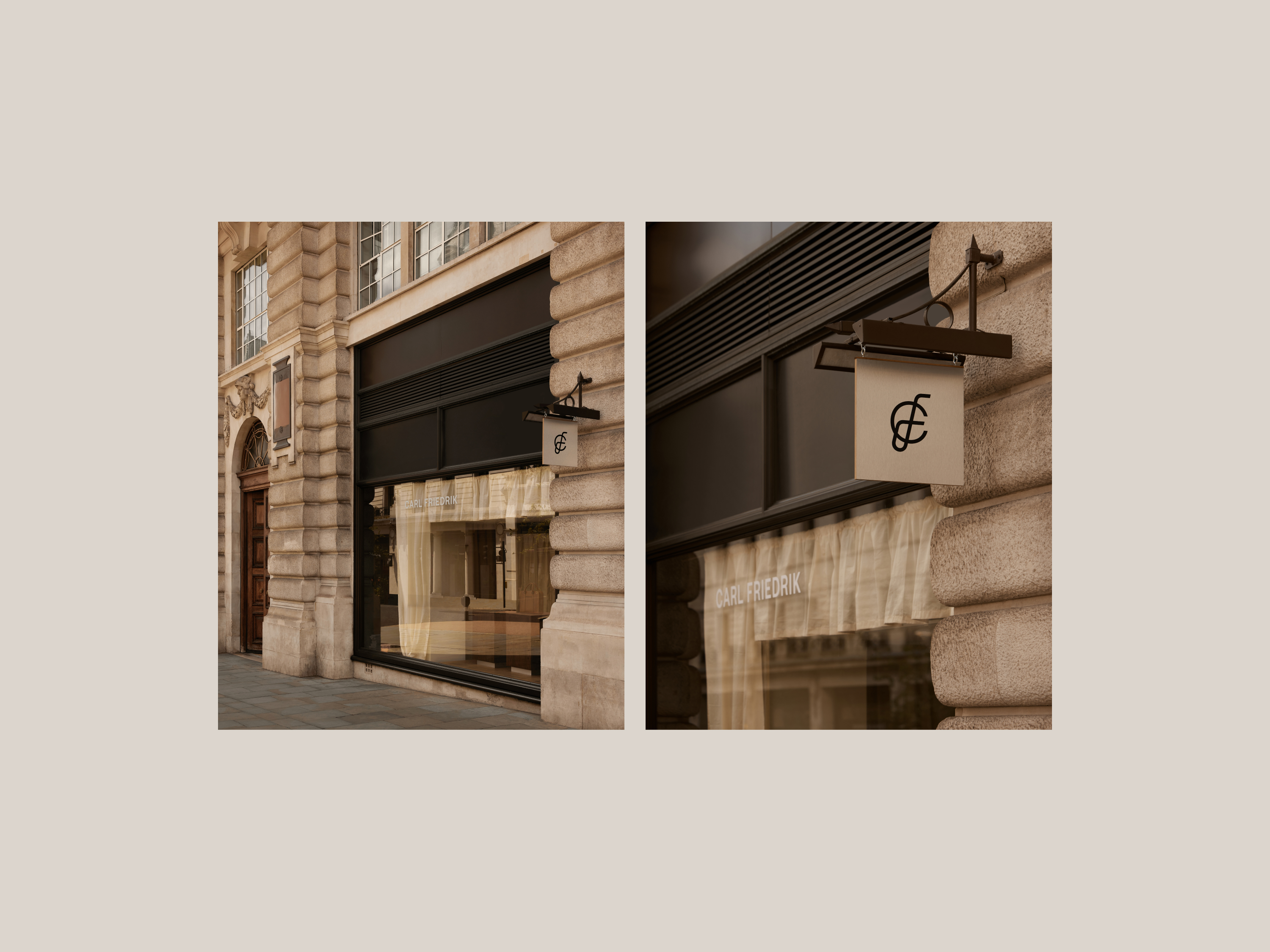
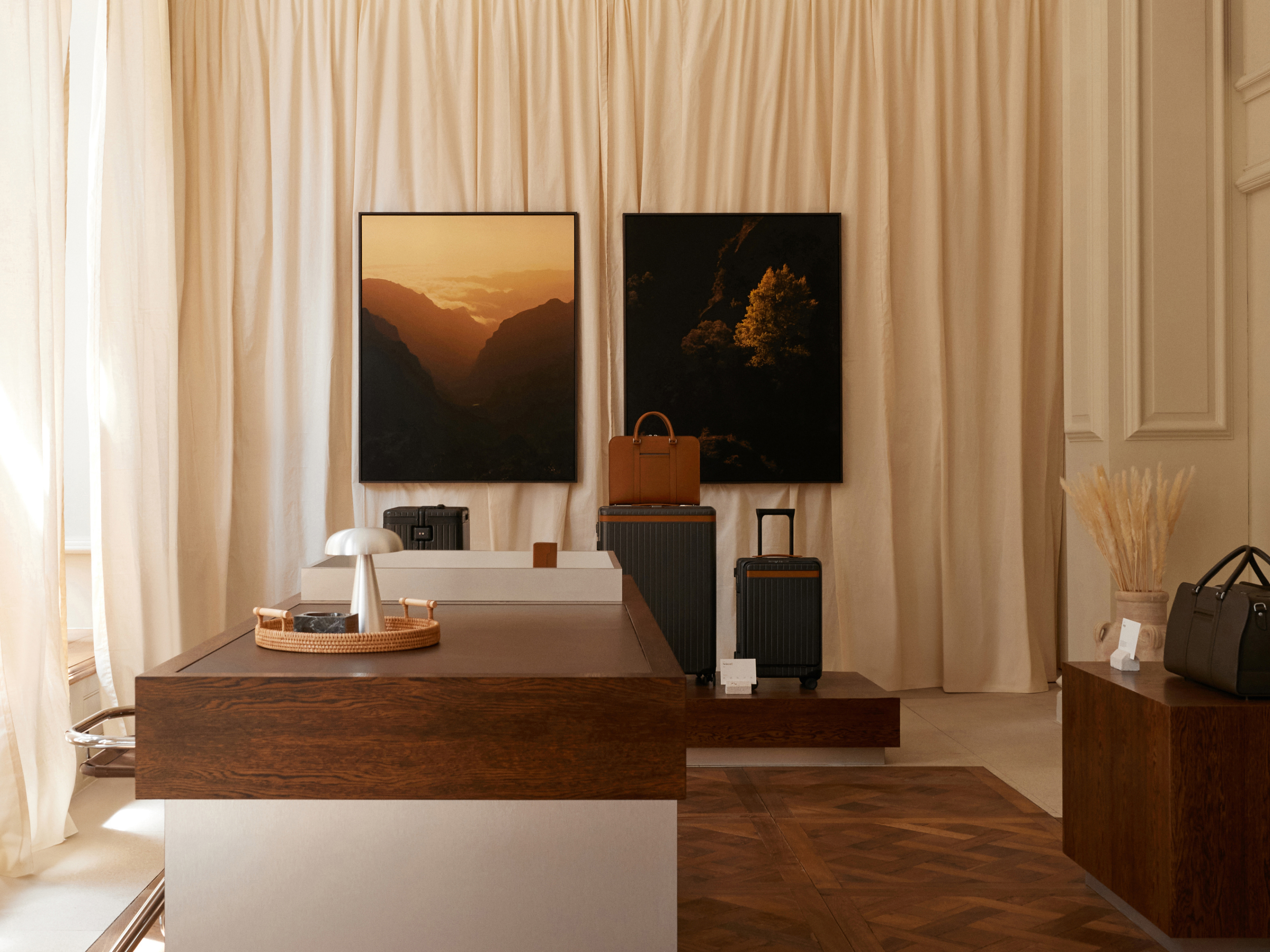
I help led a full rebrand for Carl Friedrik, inspired by their slogan Carry with Confidence, aiming to create a sleek, functional and timeless identity that balances modern design with classic quality. The refresh included a thoughtful exploration of colour and typography, crafting a cohesive visual language paired with refined photography to convey understated luxury and storytelling.
Beyond visuals, I redesigned packaging, care envelopes, vinyls, signage, video installation and stationery for their flagship store on Regent Street, London. I also contributed to window display fit-outs, enhancing the overall physical retail experience. Additionally, I designed minimalist carrier bags aligned with the new colour palette and oversaw their production to ensure quality and consistency.
A bespoke monogram embossing was created for leather products, reinforcing brand craftsmanship, alongside product cards and resource fit-outs to maintain brand unity across all touchpoints.
The rebrand delivers a timeless, elegant identity that embodies Carl Friedrik’s commitment to style, function and confidence.
Brand Identity, Store Design, Packgaging
Details ︎︎︎
I help led a full rebrand for Carl Friedrik, inspired by their slogan Carry with Confidence, aiming to create a sleek, functional and timeless identity that balances modern design with classic quality. The refresh included a thoughtful exploration of colour and typography, crafting a cohesive visual language paired with refined photography to convey understated luxury and storytelling.
Beyond visuals, I redesigned packaging, care envelopes, vinyls, signage, video installation and stationery for their flagship store on Regent Street, London. I also contributed to window display fit-outs, enhancing the overall physical retail experience. Additionally, I designed minimalist carrier bags aligned with the new colour palette and oversaw their production to ensure quality and consistency.
A bespoke monogram embossing was created for leather products, reinforcing brand craftsmanship, alongside product cards and resource fit-outs to maintain brand unity across all touchpoints.
The rebrand delivers a timeless, elegant identity that embodies Carl Friedrik’s commitment to style, function and confidence.

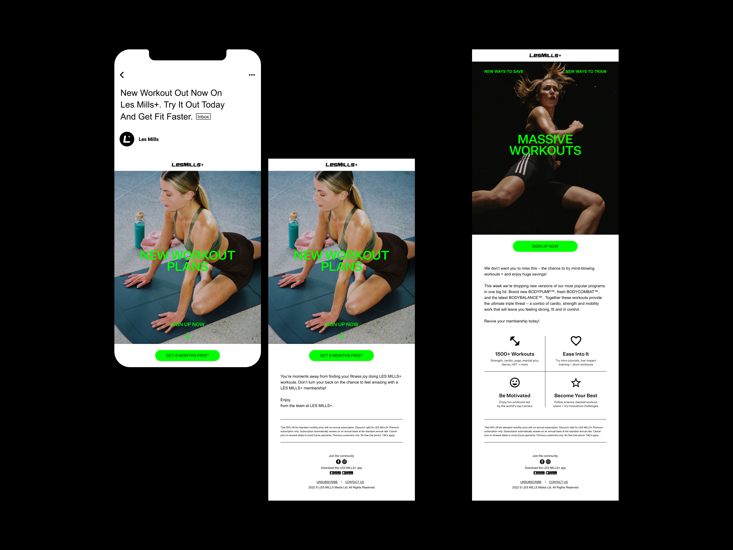
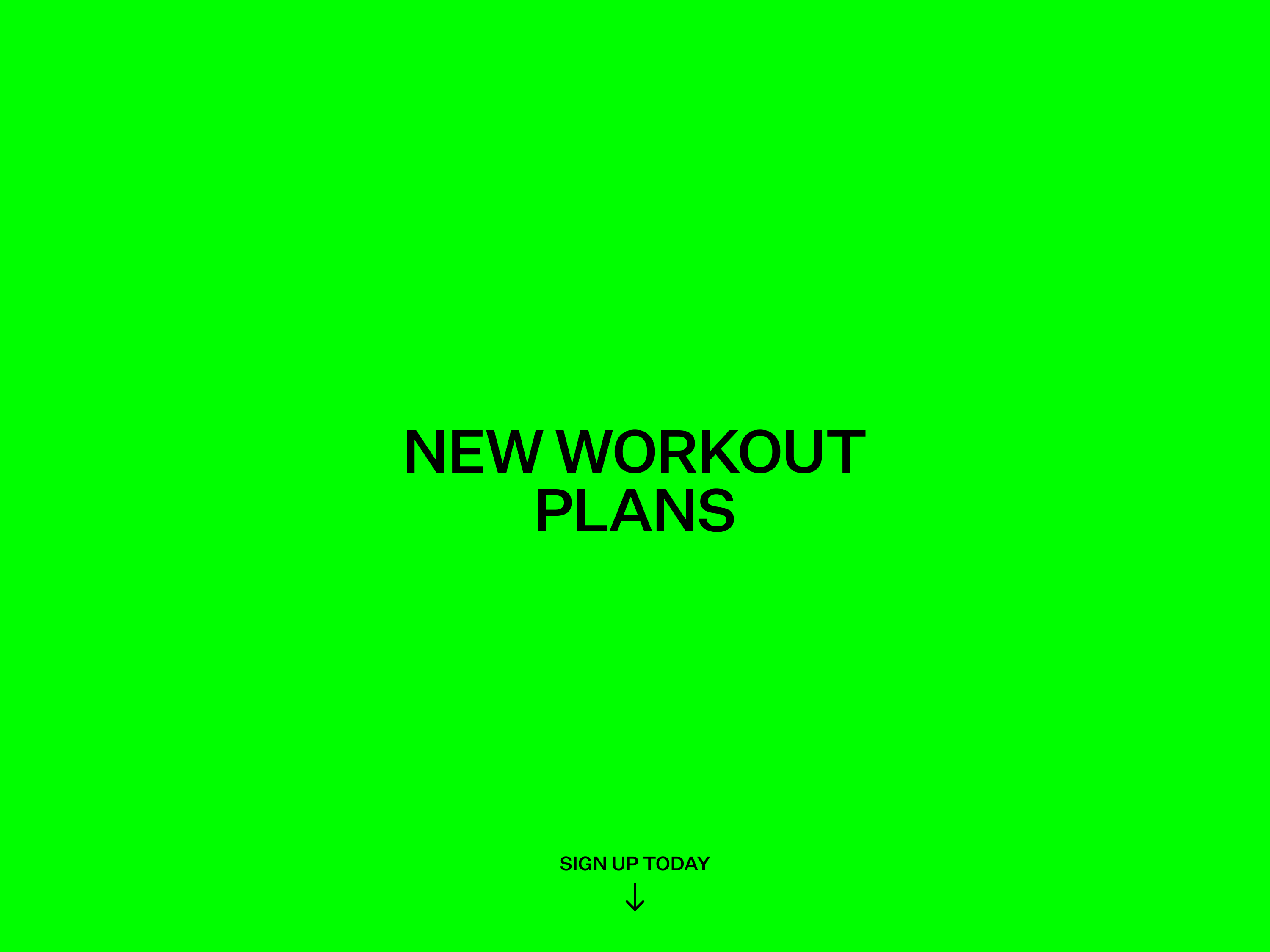
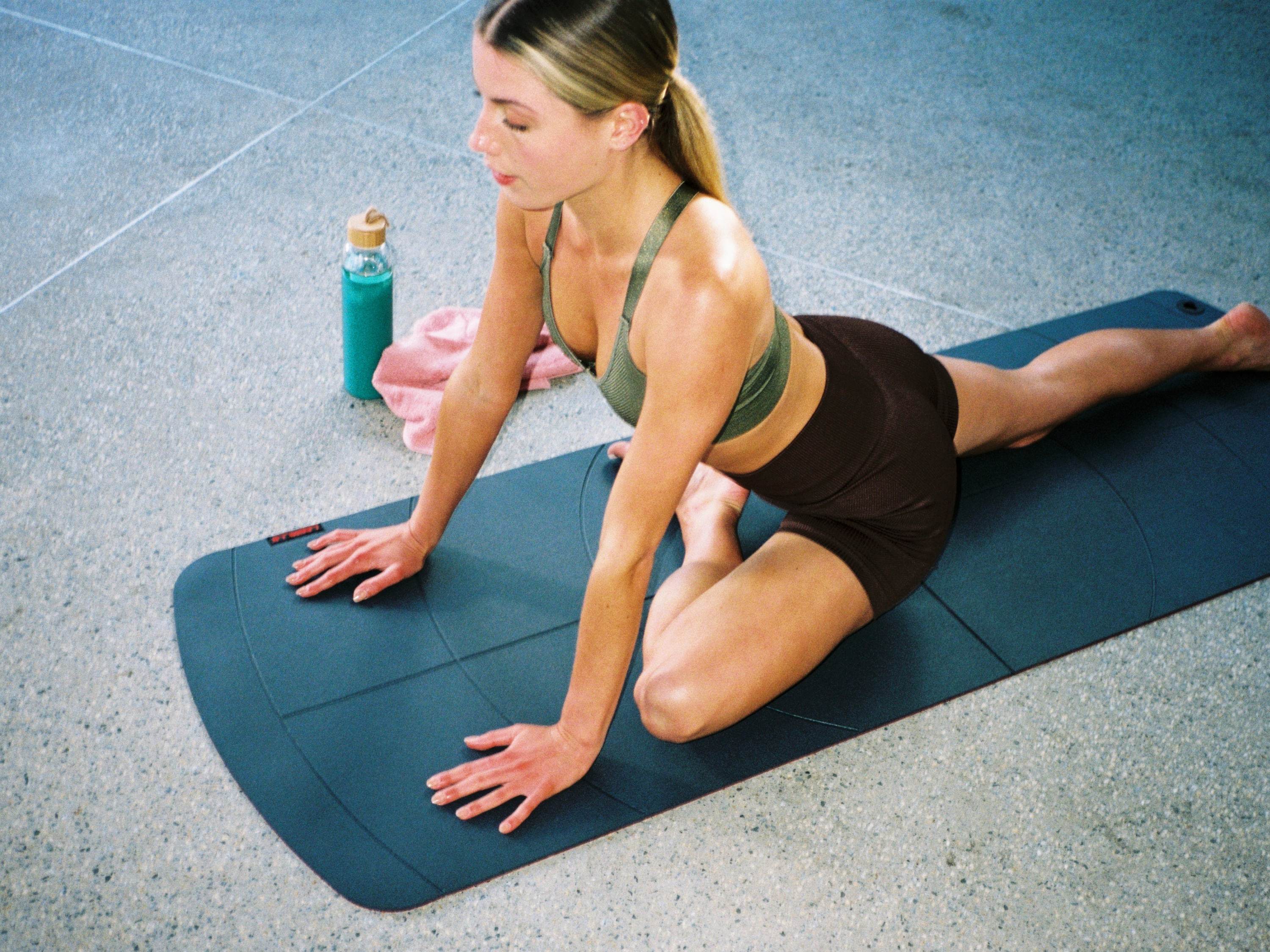
Les Mills+
Email Design, UX/UI Design
The objective of this project was to design and implement a visually engaging, user-friendly new look for Les Mills+ emails. While adhering to the brand guidelines, the design explored fresh ways to integrate colour and photography, creating a dynamic and engaging digital experience.
Close collaboration with the digital product and web development teams ensured the final product was both aesthetically polished and highly functional. The resulting system was optimised for desktop and mobile, delivering a seamless user experience for Les Mills+ subscribers. By combining brand consistency with a bold colour palette and striking imagery, the project achieved a design that was both on-brand and visually compelling.
Email Design, UX/UI Design
Details ︎︎︎
The objective of this project was to design and implement a visually engaging, user-friendly new look for Les Mills+ emails. While adhering to the brand guidelines, the design explored fresh ways to integrate colour and photography, creating a dynamic and engaging digital experience.
Close collaboration with the digital product and web development teams ensured the final product was both aesthetically polished and highly functional. The resulting system was optimised for desktop and mobile, delivering a seamless user experience for Les Mills+ subscribers. By combining brand consistency with a bold colour palette and striking imagery, the project achieved a design that was both on-brand and visually compelling.

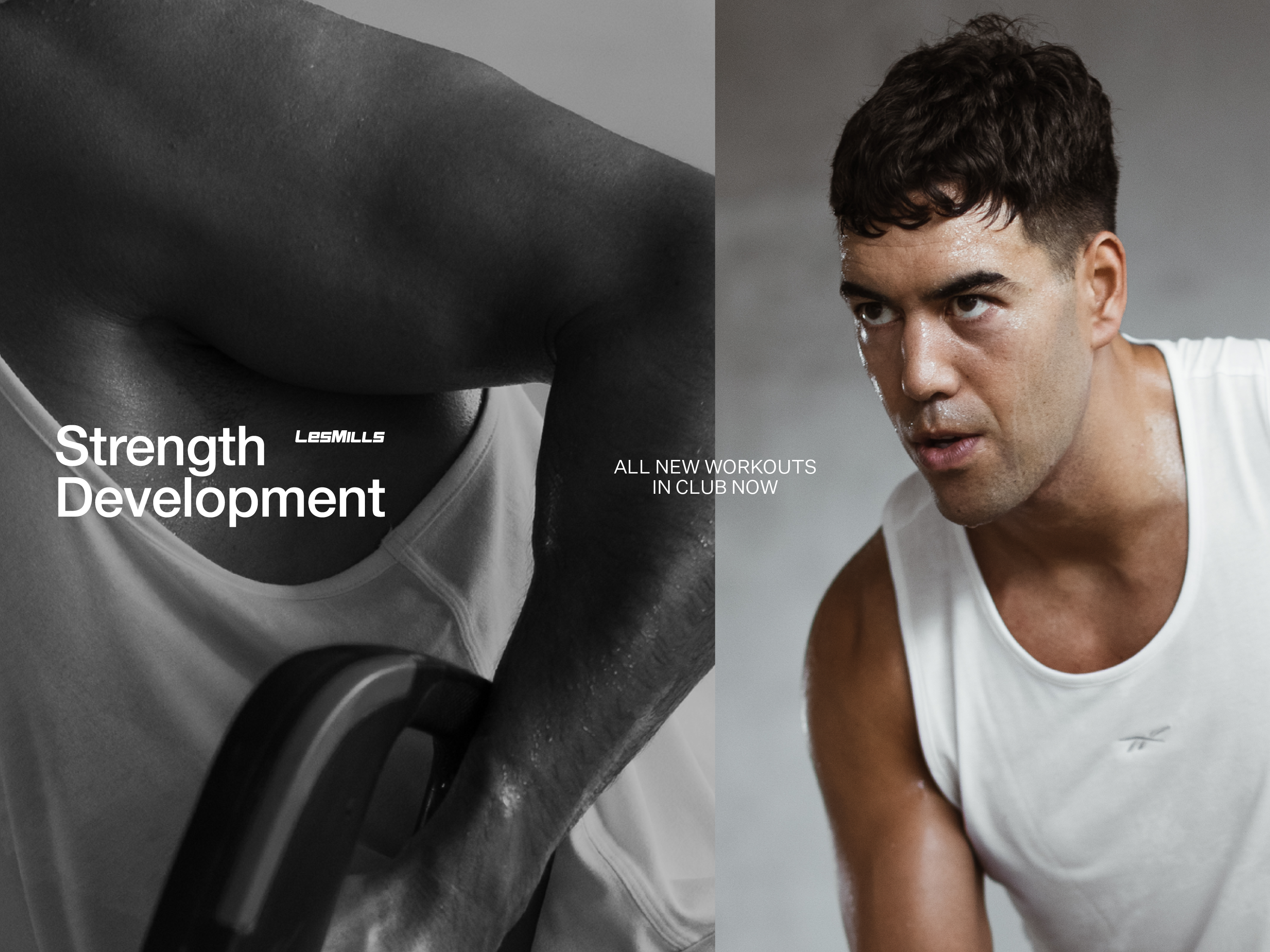
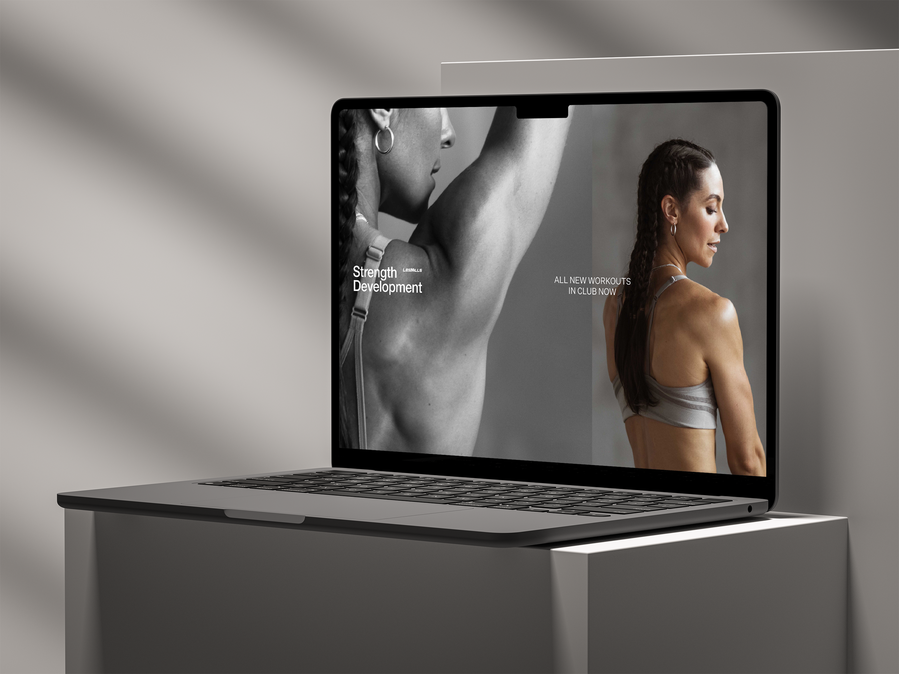
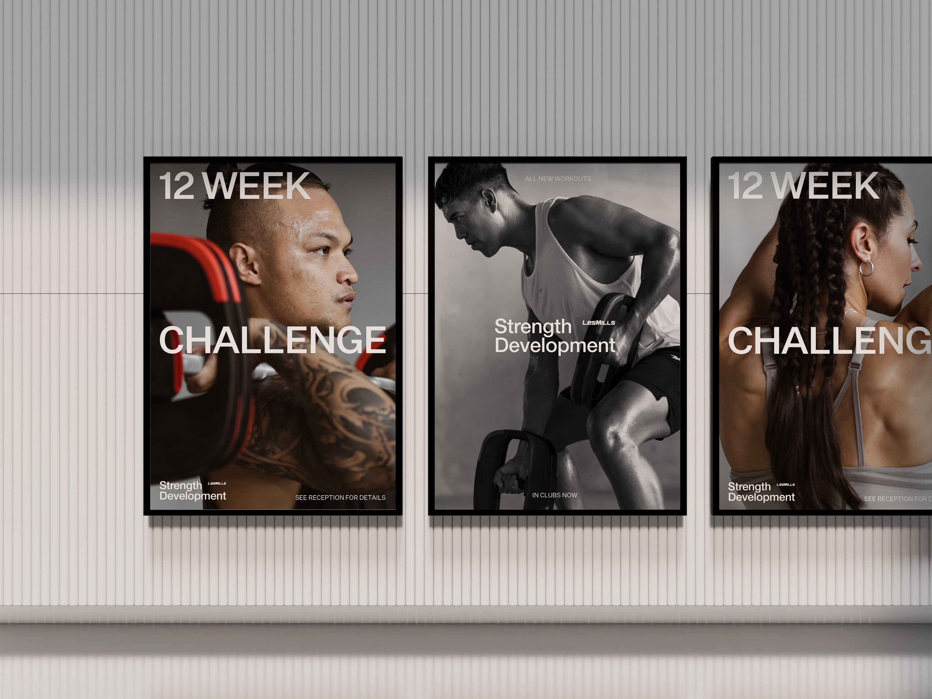
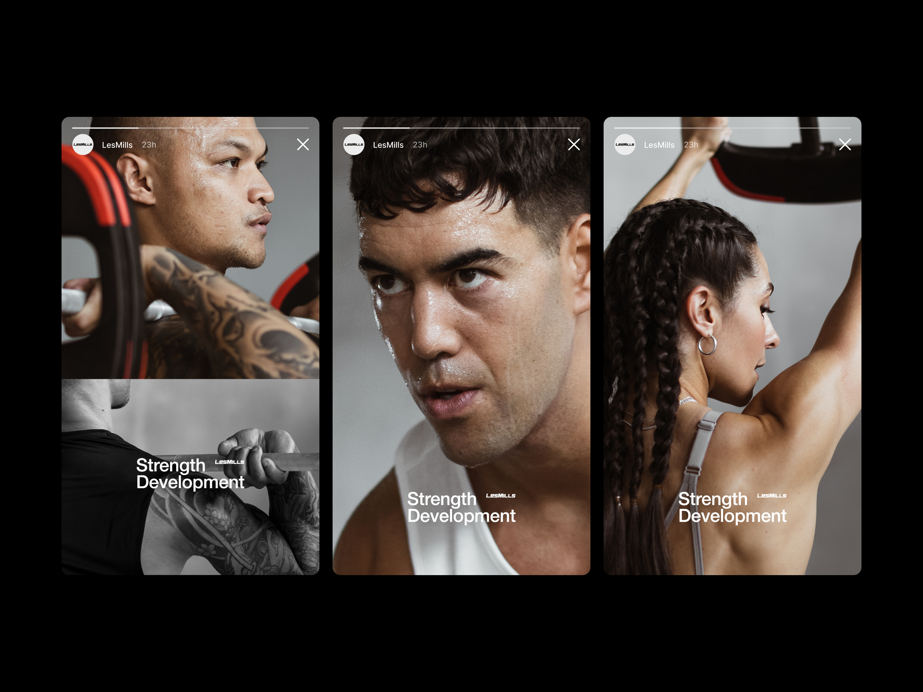
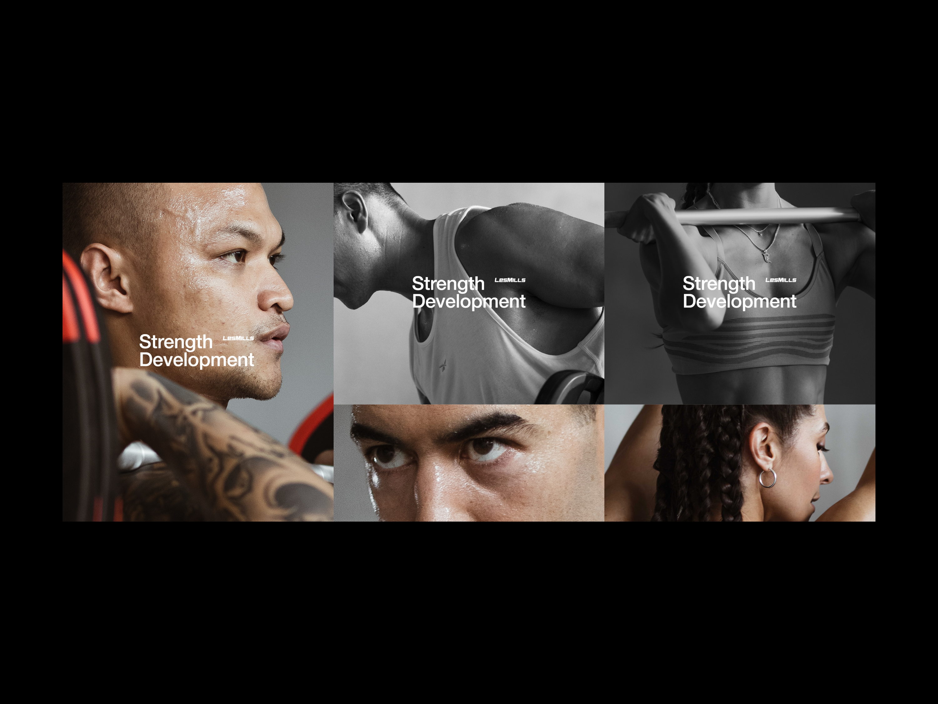
Les Mills Strength Development
Creative Direction, Brand Identity
This branding project introduced a new programme, Les Mills Strength Development, through a range of promotional assets spanning social media and in-club materials such as club passes, posters and digital displays.
With a core focus on muscular development, the programme emphasised correct posture and technique. These principles guided the design approach, which sought to capture movement, progression and emotion through tight muscle crops, visible perspiration and expressive facial moments. The result conveys the rawness, strength and energy of the programme—aiming to inspire participants to leave each class feeling stronger and more accomplished.
Creative Direction, Brand Identity
Details ︎︎︎
This branding project introduced a new programme, Les Mills Strength Development, through a range of promotional assets spanning social media and in-club materials such as club passes, posters and digital displays.
With a core focus on muscular development, the programme emphasised correct posture and technique. These principles guided the design approach, which sought to capture movement, progression and emotion through tight muscle crops, visible perspiration and expressive facial moments. The result conveys the rawness, strength and energy of the programme—aiming to inspire participants to leave each class feeling stronger and more accomplished.
Aupuni Mō‘ī o Hawai‘i (Kingdom of Hawai‘i)
Exhibition, Installation, Large Scale Print
Best Awards (Gold)
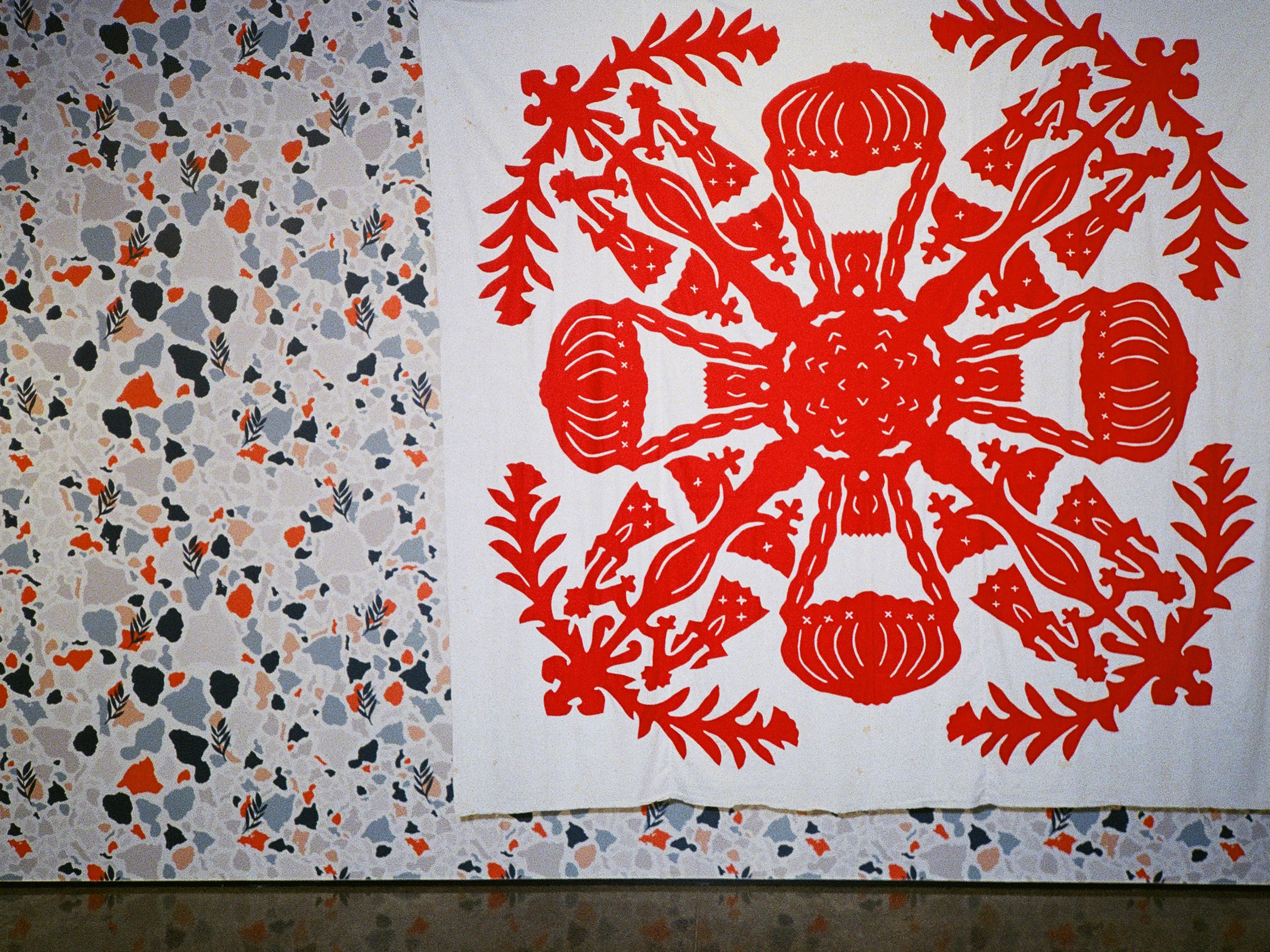
The Heirloom Kapa quilt, created in 1910, holds profound historical significance and served as the inspiration for the wallpaper installation. Measuring 7.8 x 4.2 metres, the wallpaper responds to the recurring crown motif—traditionally a symbol of Hawaiian royal power and authority. In the quilt, however, this symbol is reimagined as a representation of the Hawaiian people’s independence, resilience and self-determination. It stands as a testament to their strength in the face of adversity, particularly during their resistance to the overthrow of the monarchy.
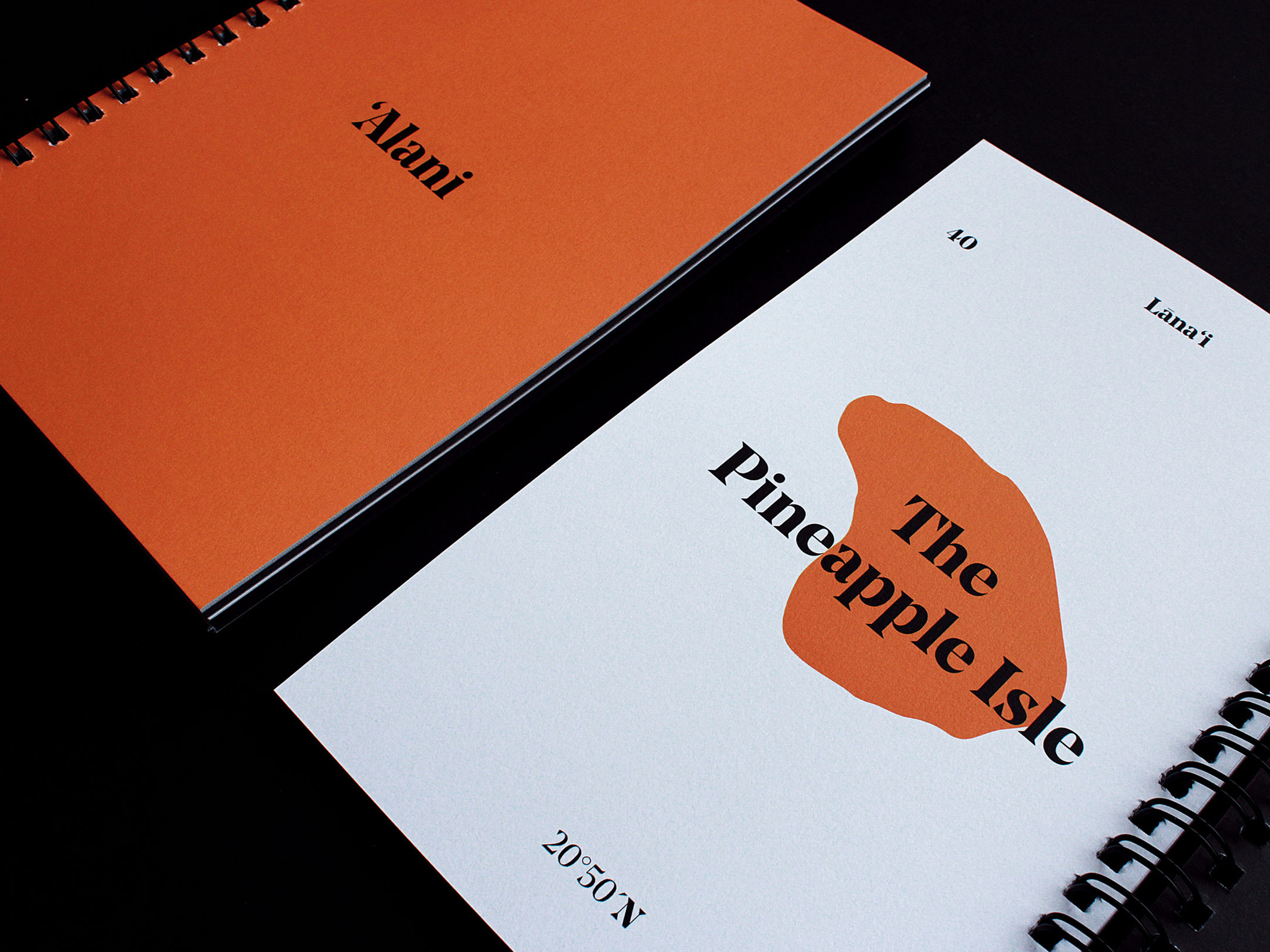
The wallpaper’s design draws from the formal elements of Hawai‘i’s eight main islands: Hawai‘i (The Big Island), Maui, O‘ahu, Kaua‘i, Moloka‘i, Lāna‘i, Ni‘ihau, and Kaho‘olawe. By reconfiguring and juxtaposing these island shapes, the pattern takes on a terrazzo-like appearance. Colour selection is equally meaningful, with each island’s official colour incorporated to deepen the work’s symbolic resonance.
Ultimately, the wallpaper installation offers a contemporary interpretation of the Heirloom Kapa quilt, honouring the richness of Hawaiian culture and history while paying tribute to its enduring artistry.
Exhibition, Installation, Large Scale Print
Best Awards (Gold)
Details ︎︎︎
The Heirloom Kapa quilt, created in 1910, holds profound historical significance and served as the inspiration for the wallpaper installation. Measuring 7.8 x 4.2 metres, the wallpaper responds to the recurring crown motif—traditionally a symbol of Hawaiian royal power and authority. In the quilt, however, this symbol is reimagined as a representation of the Hawaiian people’s independence, resilience and self-determination. It stands as a testament to their strength in the face of adversity, particularly during their resistance to the overthrow of the monarchy.
The wallpaper’s design draws from the formal elements of Hawai‘i’s eight main islands: Hawai‘i (The Big Island), Maui, O‘ahu, Kaua‘i, Moloka‘i, Lāna‘i, Ni‘ihau, and Kaho‘olawe. By reconfiguring and juxtaposing these island shapes, the pattern takes on a terrazzo-like appearance. Colour selection is equally meaningful, with each island’s official colour incorporated to deepen the work’s symbolic resonance.
Ultimately, the wallpaper installation offers a contemporary interpretation of the Heirloom Kapa quilt, honouring the richness of Hawaiian culture and history while paying tribute to its enduring artistry.


Raf Simons Catalouge
Publication
Best Awards (Silver)
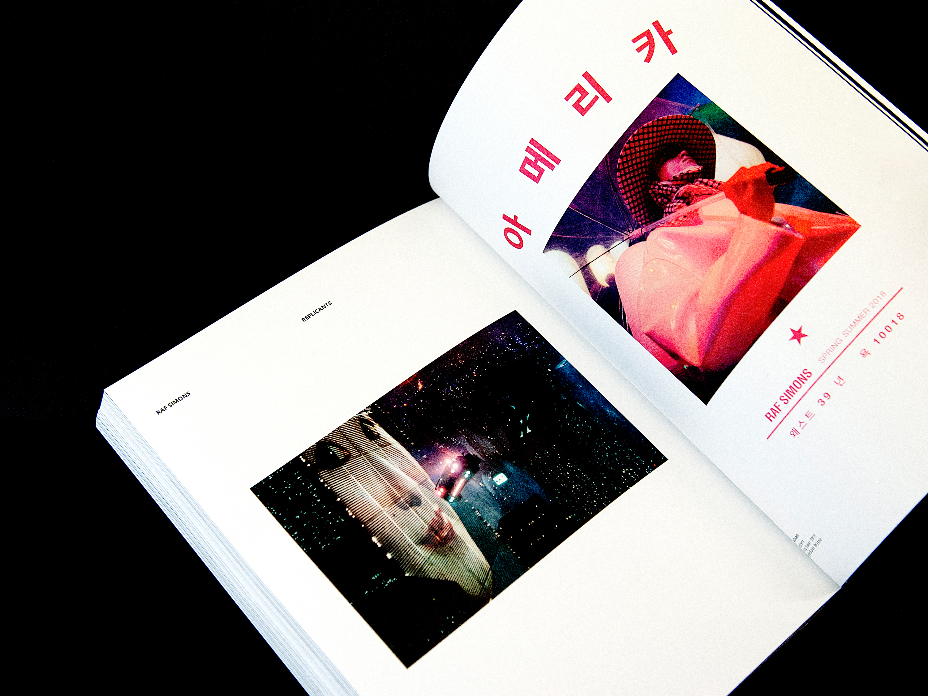
This project undertakes a meticulous examination of Raf Simons’ diverse influences, researching every collection from 1995 to 2018 with particular attention to typography, art, design, music and underground subcultures.
The resulting publication commemorates and celebrates the distinctive typographic and graphic techniques woven throughout Simons’ work. Designed with care, it reflects the evolution of his collections over more than two decades.
Through rigorous research and thoughtful design, the publication offers a profound tribute to Simons’ innovation, creativity and singular vision—qualities that have left a lasting mark on the fashion industry.
Publication
Best Awards (Silver)
Details ︎︎︎
This project undertakes a meticulous examination of Raf Simons’ diverse influences, researching every collection from 1995 to 2018 with particular attention to typography, art, design, music and underground subcultures.
The resulting publication commemorates and celebrates the distinctive typographic and graphic techniques woven throughout Simons’ work. Designed with care, it reflects the evolution of his collections over more than two decades.
Through rigorous research and thoughtful design, the publication offers a profound tribute to Simons’ innovation, creativity and singular vision—qualities that have left a lasting mark on the fashion industry.


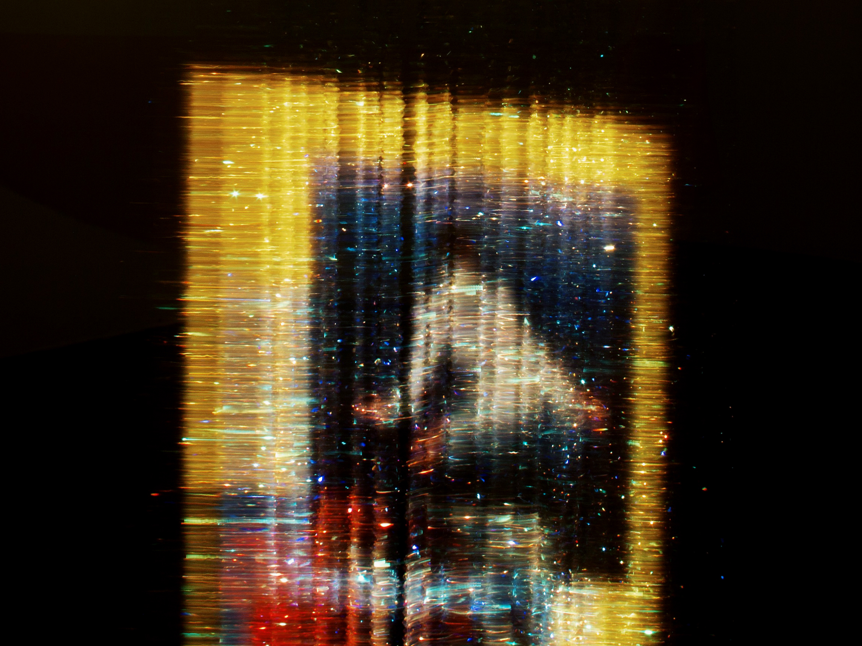
Golden
Exhibition, Installation, Video
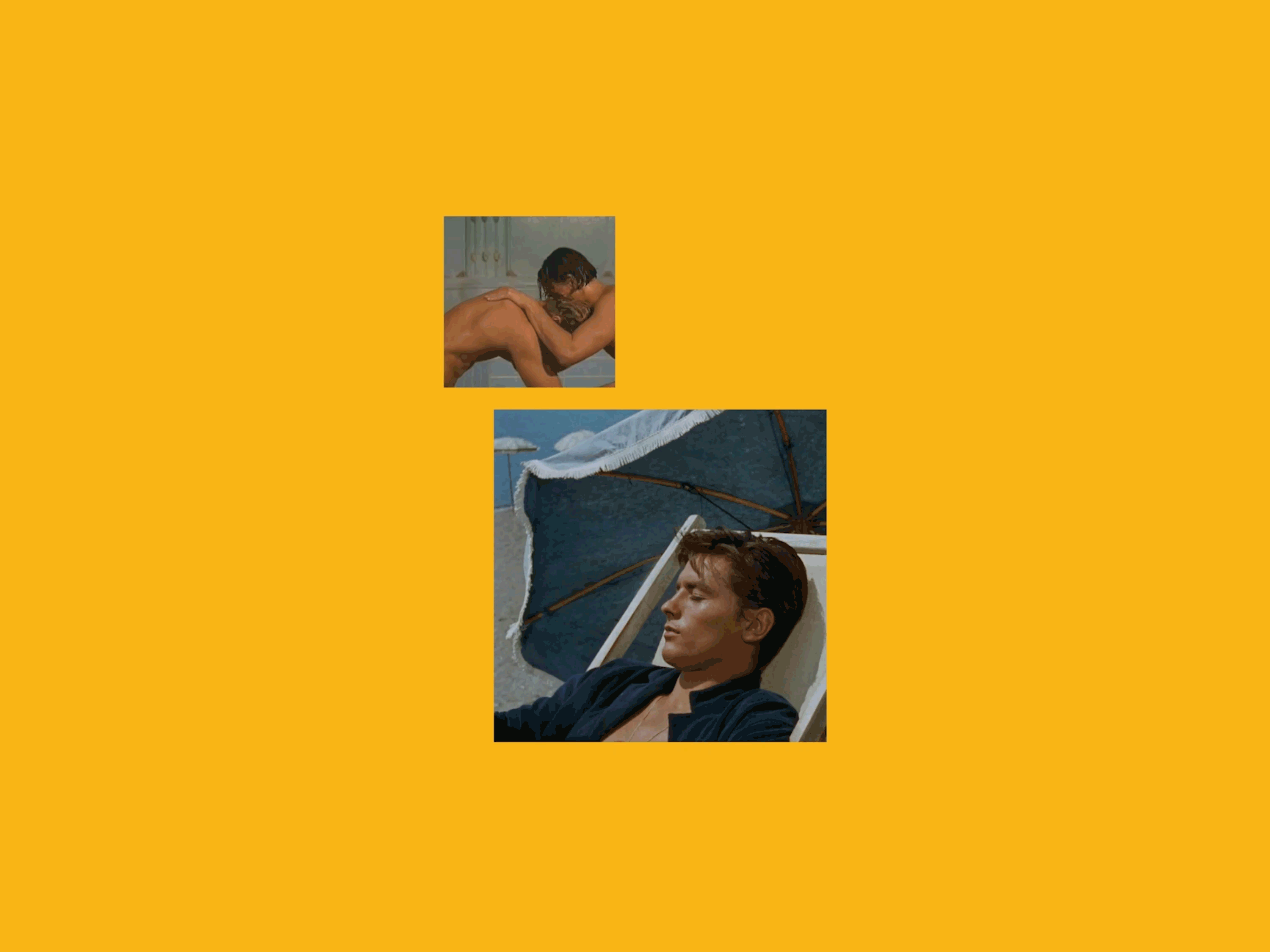
This installation draws on the visual technique of démontage employed by French author Georges Bataille, a process of undoing the intended or potential meaning of a group of images, dismantling and juxtaposing them to generate new interpretations.
Here, démontage is applied to imagery that engages with notions of glamour and eroticism. The reconfigured images are projected onto 10,000 hand-beaded crystals suspended from a wire. Behind them, organically dyed turmeric silk is revealed. The silk’s partial transparency and subtle imperfections evoke the idea of a fragile barrier—one that resists invasive imagery while also embodying vulnerability and privacy. It becomes a temporary divider between public and private spaces.
Through the interplay of démontage and the silk’s material presence, the work invites viewers to interrogate the shifting boundary between public and private spheres. It encourages critical engagement with the ways images can simultaneously expose and conceal aspects of ourselves and our societies. By dismantling and reconstructing visual content, the installation forges a new visual language—one that reflects the complexity and fluidity of human experience.
Exhibition, Installation, Video
Details ︎︎︎
This installation draws on the visual technique of démontage employed by French author Georges Bataille, a process of undoing the intended or potential meaning of a group of images, dismantling and juxtaposing them to generate new interpretations.
Here, démontage is applied to imagery that engages with notions of glamour and eroticism. The reconfigured images are projected onto 10,000 hand-beaded crystals suspended from a wire. Behind them, organically dyed turmeric silk is revealed. The silk’s partial transparency and subtle imperfections evoke the idea of a fragile barrier—one that resists invasive imagery while also embodying vulnerability and privacy. It becomes a temporary divider between public and private spaces.
Through the interplay of démontage and the silk’s material presence, the work invites viewers to interrogate the shifting boundary between public and private spheres. It encourages critical engagement with the ways images can simultaneously expose and conceal aspects of ourselves and our societies. By dismantling and reconstructing visual content, the installation forges a new visual language—one that reflects the complexity and fluidity of human experience.
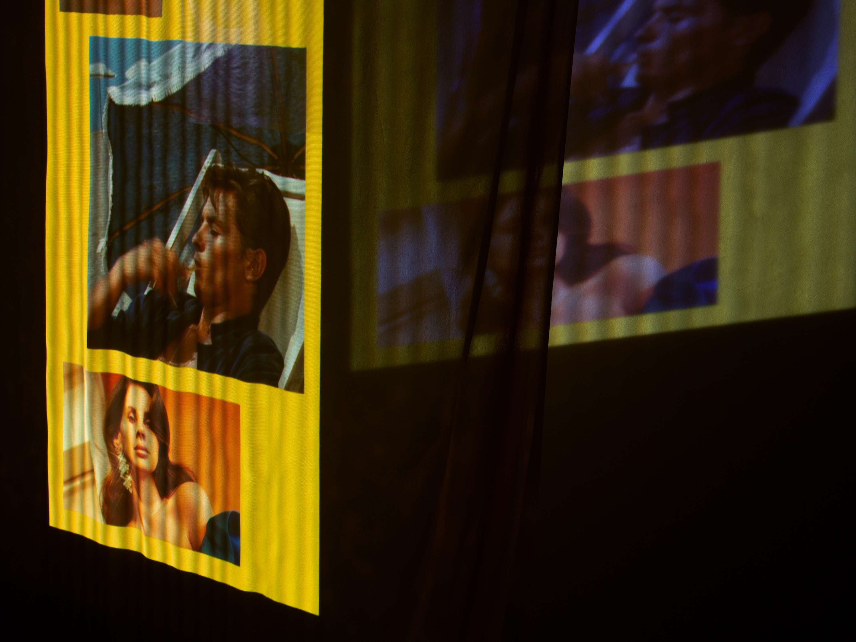
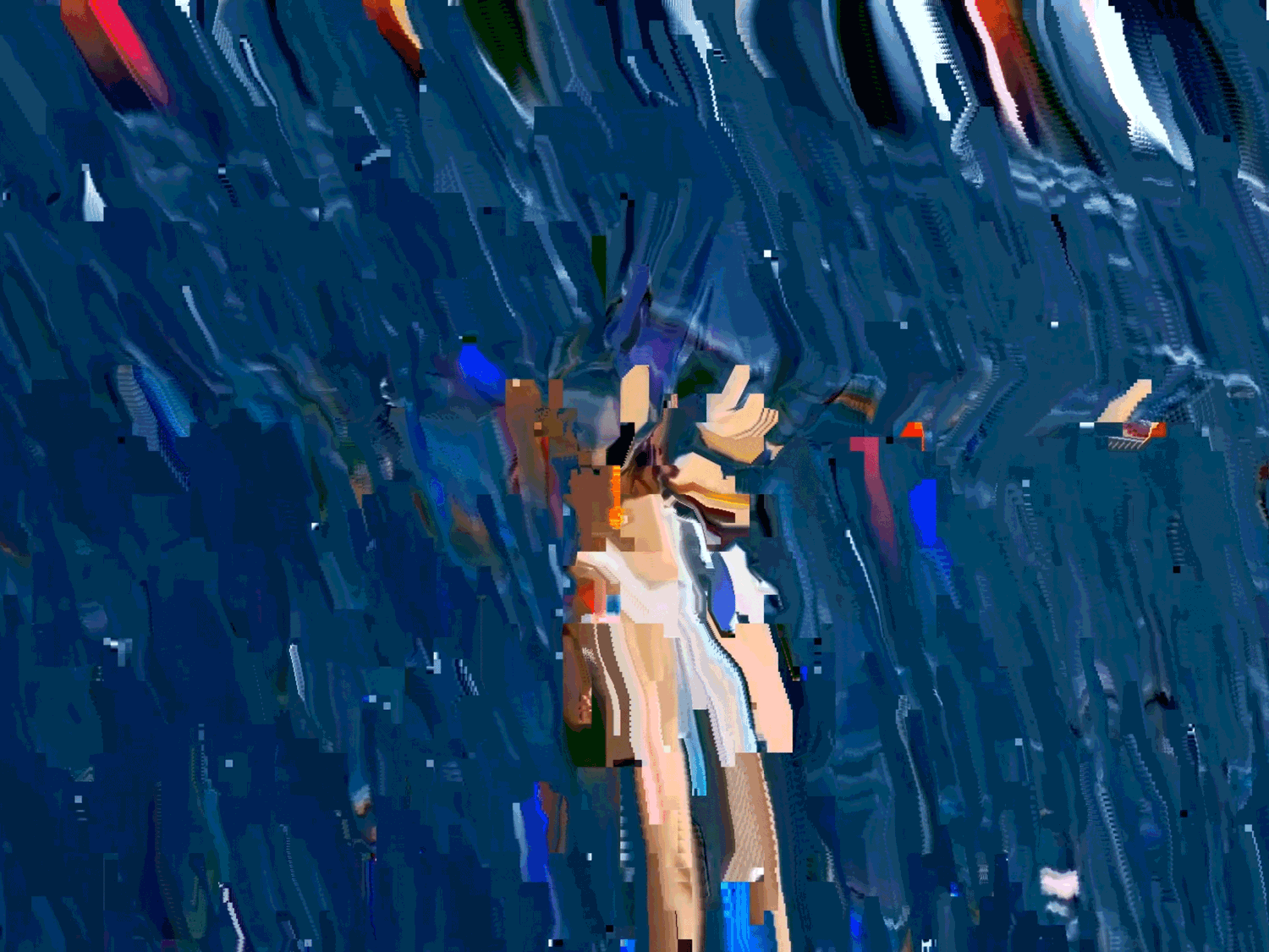
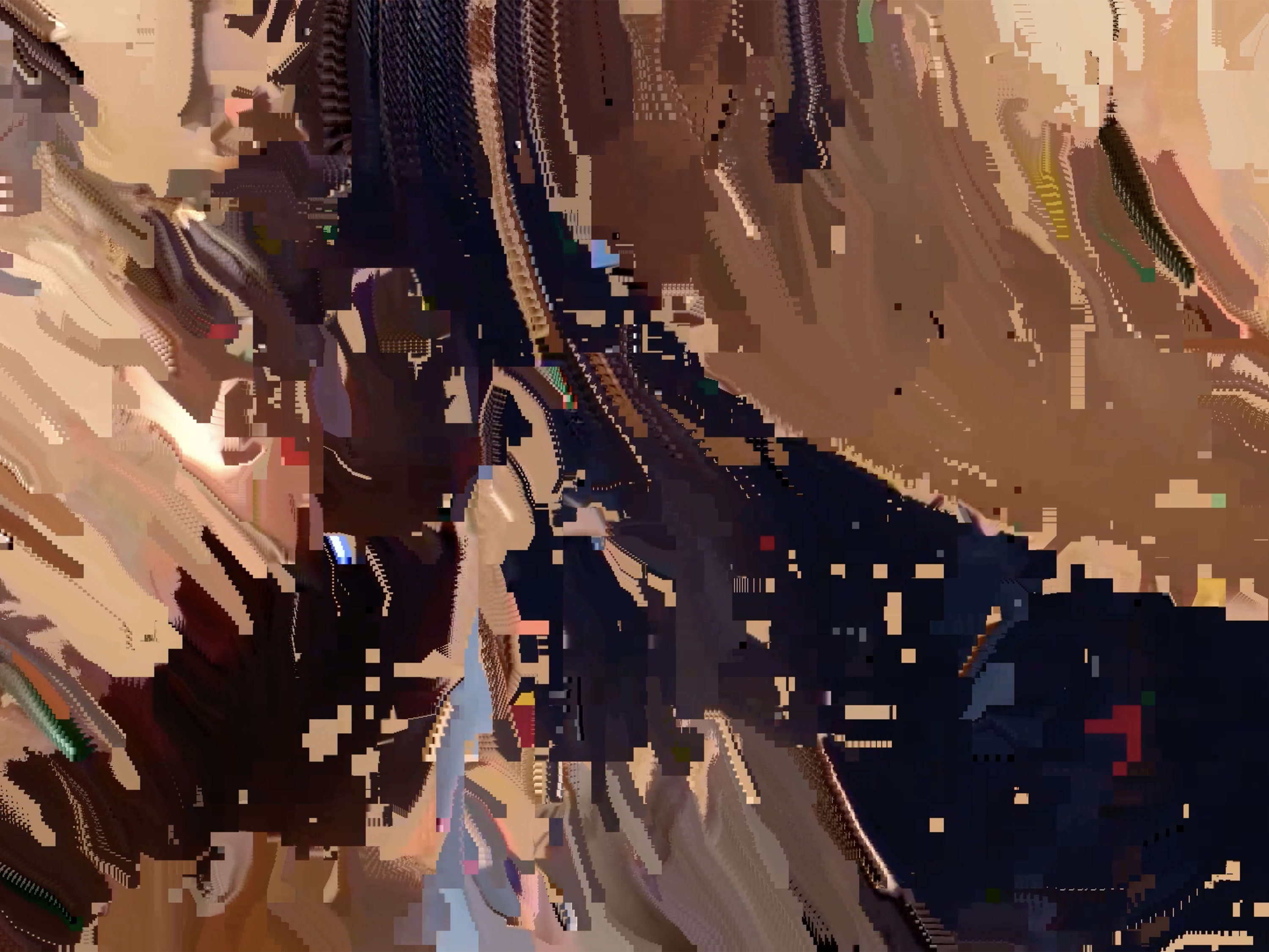
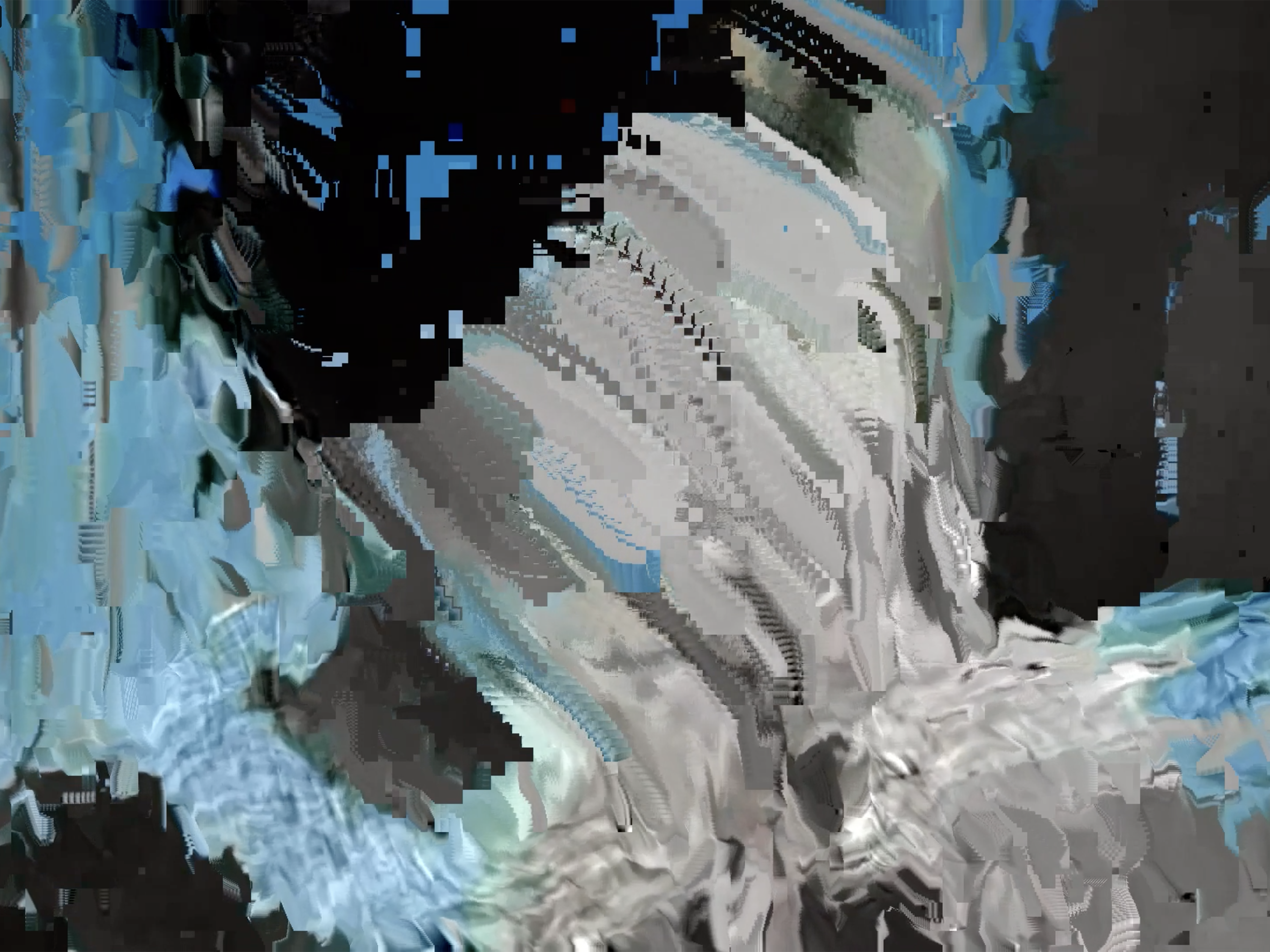
สีชมพู Pink
Exhibition, Video
สชีมพู Pink seeks to carve out space from within dominant narratives, generating new structures and modes of expression. The work opens alternative territories, illuminating the power, knowledge and joy that reside at the margins. It assembles a matrix between my heritage and personal experiences to undermine the authority of mass media and challenge the dominance of Western and heterosexual culture.
With the rise of the internet and its multiple social-media platforms, a phantasmagoria by which I mean an ever-present digital spectacle that bombards us with deceptive illusions, emerges from capitalist consumerism, promoting Western normalising ideologies.
In this online environment, capitalist strategies exploit users’ discontent by manipulating desire through luxury, glamour, and eroticism. This conceptual framework draws from twentieth-century Marxist theorist Guy Debord, whose critique of spectacle, despite its mid-century origins, remains relevant in today’s hyper-technologised, interconnected world.
To expose this phantasmagoria, the work employs culture-jamming and diversion, subverting internet imagery by digitally manipulating pixels. In doing so, it reveals the mechanics of commodity fetishism, the policing of appearance, the construction of norms and the paradox of social alienation in an era of hyper-connectivity.
Exhibition, Video
Details ︎︎︎
สชีมพู Pink seeks to carve out space from within dominant narratives, generating new structures and modes of expression. The work opens alternative territories, illuminating the power, knowledge and joy that reside at the margins. It assembles a matrix between my heritage and personal experiences to undermine the authority of mass media and challenge the dominance of Western and heterosexual culture.
With the rise of the internet and its multiple social-media platforms, a phantasmagoria by which I mean an ever-present digital spectacle that bombards us with deceptive illusions, emerges from capitalist consumerism, promoting Western normalising ideologies.
In this online environment, capitalist strategies exploit users’ discontent by manipulating desire through luxury, glamour, and eroticism. This conceptual framework draws from twentieth-century Marxist theorist Guy Debord, whose critique of spectacle, despite its mid-century origins, remains relevant in today’s hyper-technologised, interconnected world.
To expose this phantasmagoria, the work employs culture-jamming and diversion, subverting internet imagery by digitally manipulating pixels. In doing so, it reveals the mechanics of commodity fetishism, the policing of appearance, the construction of norms and the paradox of social alienation in an era of hyper-connectivity.